Designing Our Logo
When I decided it was time to start treating this company seriously, as opposed an entity which existed purely for the sake of taxes, I knew the most daunting task would be designing a logo.
I laid in bed that night thinking about past experiences with designing company and product logos. It normally takes a lot of work to fit a company’s purpose and culture into one simple image. At least I knew that I just wanted an icon, not a wordmark.1
My first idea that night was three or four circles placed evenly around a central point with motion trails behind them to give the feeling of them orbiting. But something felt too familiar and unoriginal about it. Then, in a stroke of inspiration, I had a vision of our current logo.

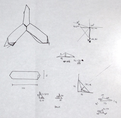
The next morning I set out to draw up the design in Inkscape, a free and open source vector graphics editor. The three blades needed to be equidistant which meant the angles between them would be 120°. If I made the exterior points the same angle as the interior points then the individual blades and the logo itself would would be highly symmetrical. The two sides of each blade would be colored differently, with the colors inspired by a Jekyll Bootstrap theme.
The biggest question was what length and width the blades should be. I wanted to play with different ratios until I found the right one. But I also knew that trigonometry would be required to get angles of the blades right. The interior points would be shared while the exterior points would be unique for a total of 13 distinct points. Each point has both an x and a y value for a grand total of 26 values I needed to calculate. I didn’t want to do all of that each time I adjusted the width or length.
I managed to decrease the number of required calculations from 26 to 6, with only one requiring trig. First, I realized that if I draw one blade then I can just copy and rotate the blade 120°. That left me with just the 6 points of the top blade.
The bottom center point of the blade would be the starting point, so I would choose those values. The top center point was also easy, being exactly the length of the blade above the bottom point. The other four points would be half the width away from the the blade along the x axis. I used the special properties of 30-60-90 triangles to determine their displacement along the y axis should be the blade width divided by 2 * √3.
I setup a spreadsheet with calculations for each of the 6 points and began drawing. On about my third try I found the ideal width/length ratio of 2/5. It turned out beautifully.

-
Read more about the different types of logos: http://www.nodinx.com/5-basic-types-of-logos/ and http://www.logodesignsource.com/types.html ↩
